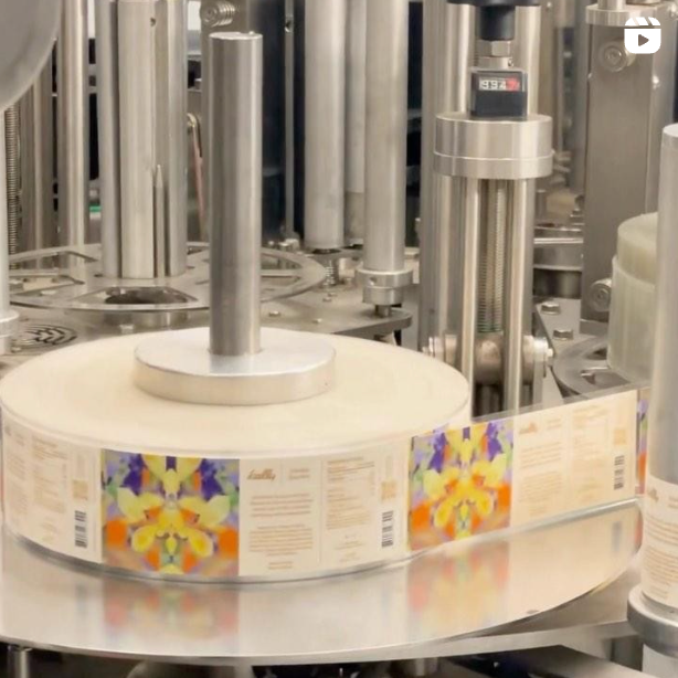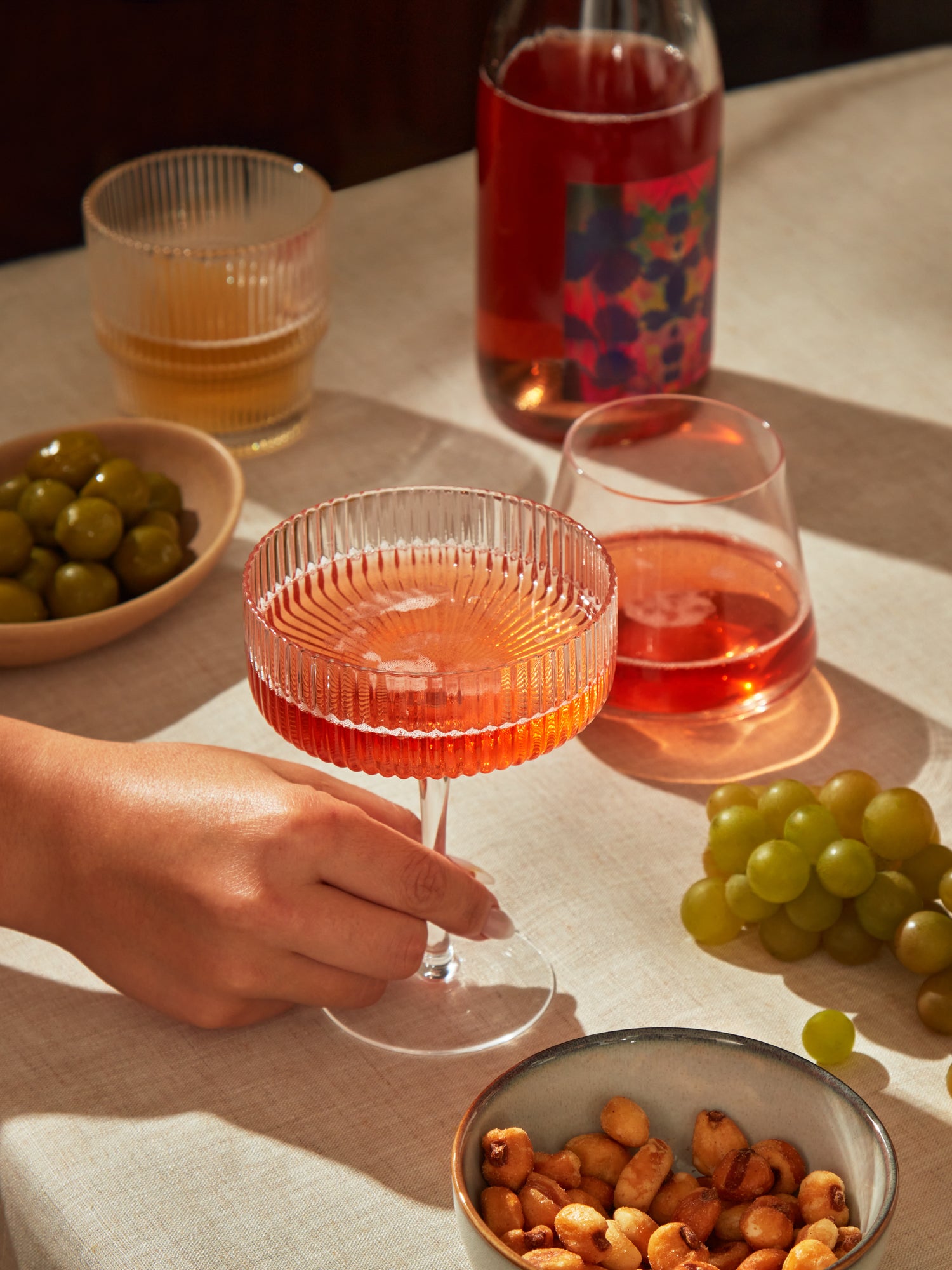
One of Kally’s hallmarks is our distinctive label art. The labels are art-forward, giving abstract representation of each recipes’ ingredients. The kaleidoscope effect creates captivating visual effects, making it easy to distinguish each recipe while unifying the brand with a common art theme.
Creating this artwork was a real labor of love. We collaborated with artist and designer Meghan Berckes to produce labels inspired by the ingredients, flavors and imagery of the brand.
We recently asked her to reflect back on the collaboration and her experience creating artwork for Kally. Here is what she had to say:
What was the inspiration for the “kaleidoscope” artwork?
Kally is truly unique and quite hard to describe so I wanted that “what is this?” provocation to start at the packaging level. Kaleidoscopes take recognizable objects and mirror them into abstraction which I thought was both a unique visual device, and a pretty cool metaphor for the transformation of ingredients in Kally.
What was the process you followed to develop the first four labels?
Katie and Scott provided me with musings of theirs for each flavor and its base ingredients, so I had a great jumping-off point. They were really evocative and set the intention for each flavor which I tried to match visually. Vanilla Smoke was described as being the mood of a night by the campfire with smoked tea and pine needles—while Berry Fennel evoked the terroir of the salty Pacific cliffs where fennel thrives in California. Each of these musings provided me with inspiration of what I could start to layer—a blanket of stars for Vanilla Smoke vs. a cresting wave for Berry Fennel.
What aspect of creating the artwork was most challenging?
Trying to create enough variation in color and pattern so they could be recognizable and differentiated. I made a few rules at the outset and treated each one as its own artwork, focusing on composition, focal point, and movement—and not slip into trippy dorm-room poster territory (no judgment here). There isn’t really a formula, I just sit down with a large glass of tea and start experimenting!
Do you have a favorite label?
Vanilla Smoke was the most fun to create because I knew it had to be dark which was going to be a huge challenge. The other labels play a lot with color but texture was more important with Vanilla Smoke.
Any other stories, thoughts or reflections you think are important, or helped to bring the Kally labels to life?
I felt like there was such an emphasis on ingredients in Kally that I really wanted to telegraph to that in some way. Early explorations had each piece highly differentiated, but some didn’t look appetizing at all. We needed the labels to add to the overall package looking delicious!
You can learn more about Meghan here and follow her on Instagram @berckes.